Summary
During my time as a UX researcher at Pixiv, I was able to join the Charcoal design system team while also managing my research projects. The existing icons in Pixiv's design system called for improvements, so we set out to create a new family of icons that reflected Pixiv's product vision.
Our goal was to create a cohesive, user-friendly visual language that would enhance the overall user experience across Pixiv digital products; our challenge was to create iconography that could achieve these goals in an expressive and functional way.
Key results
Over 250 icons integrated into the Charcoal Design System.
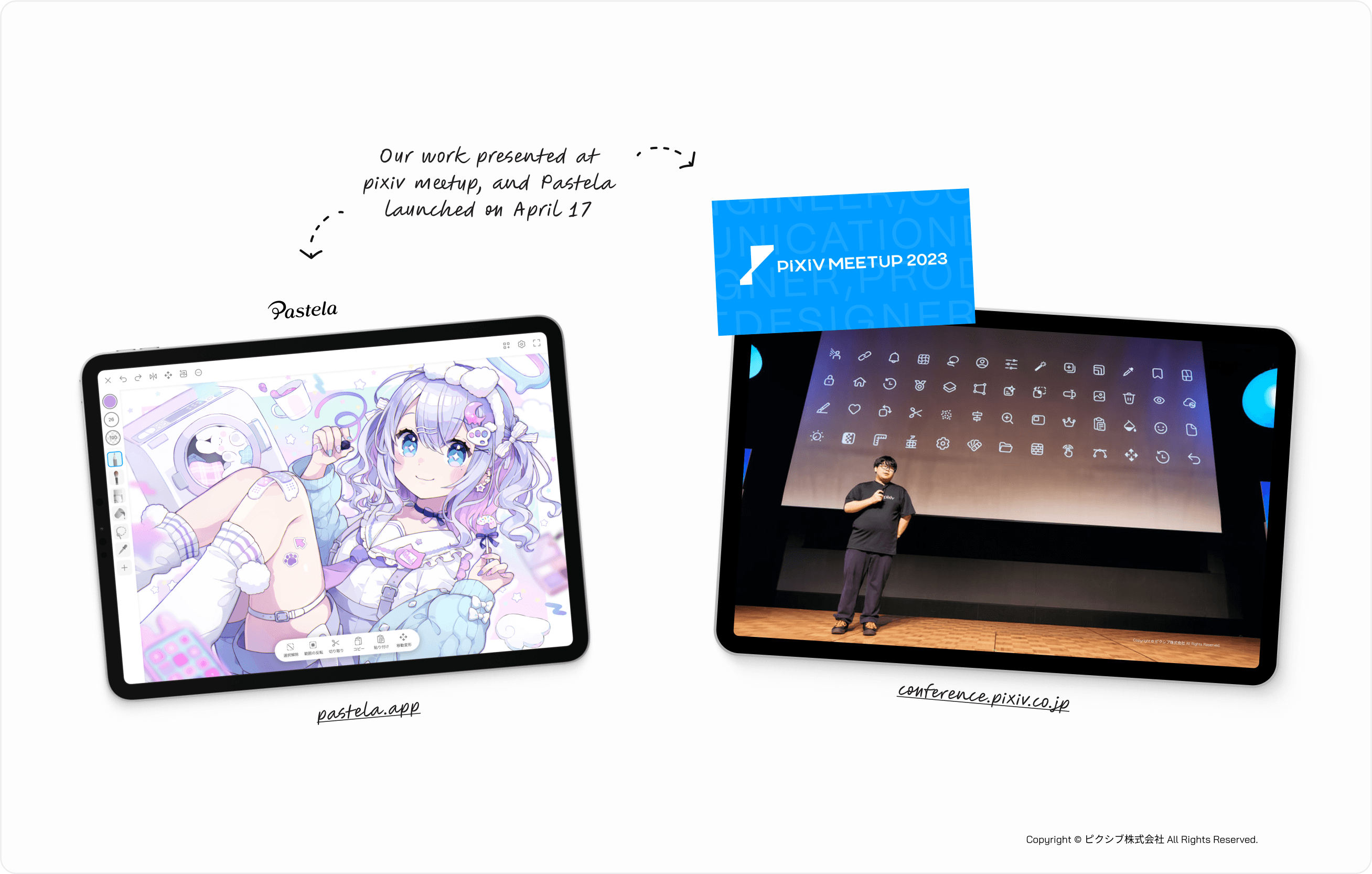
The newly released "Pastela" app ranked #1 within a week of launch, with positive feedback highlighting the icon design.
Role & timeline
Product Designer (Design Systems), Apr 2023 - Nov 2023
Skills applied
Iconography, systems thinking, user-centric design, collaboration
Understanding the task at hand
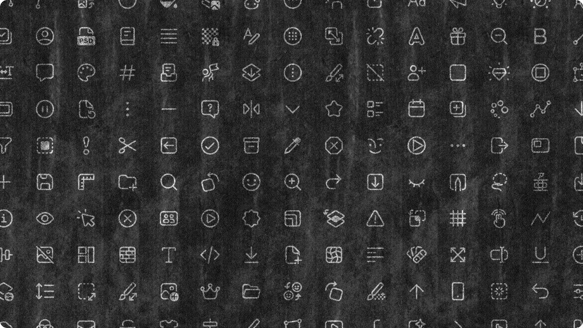
Kickstarting the project, I conducted an audit of existing icons, observing their patterns and identifying issues to later list and prioritize (The "Pastela" app, which was under development, received special attention as the pilot for the upcoming icons). Alongside that, studying design systems & icon families that shared our desired characteristics such as such as Microsoft Fluent, Ionicons, Streamline, and others, to define guiding principles and approaches that would benefit Charcoal.
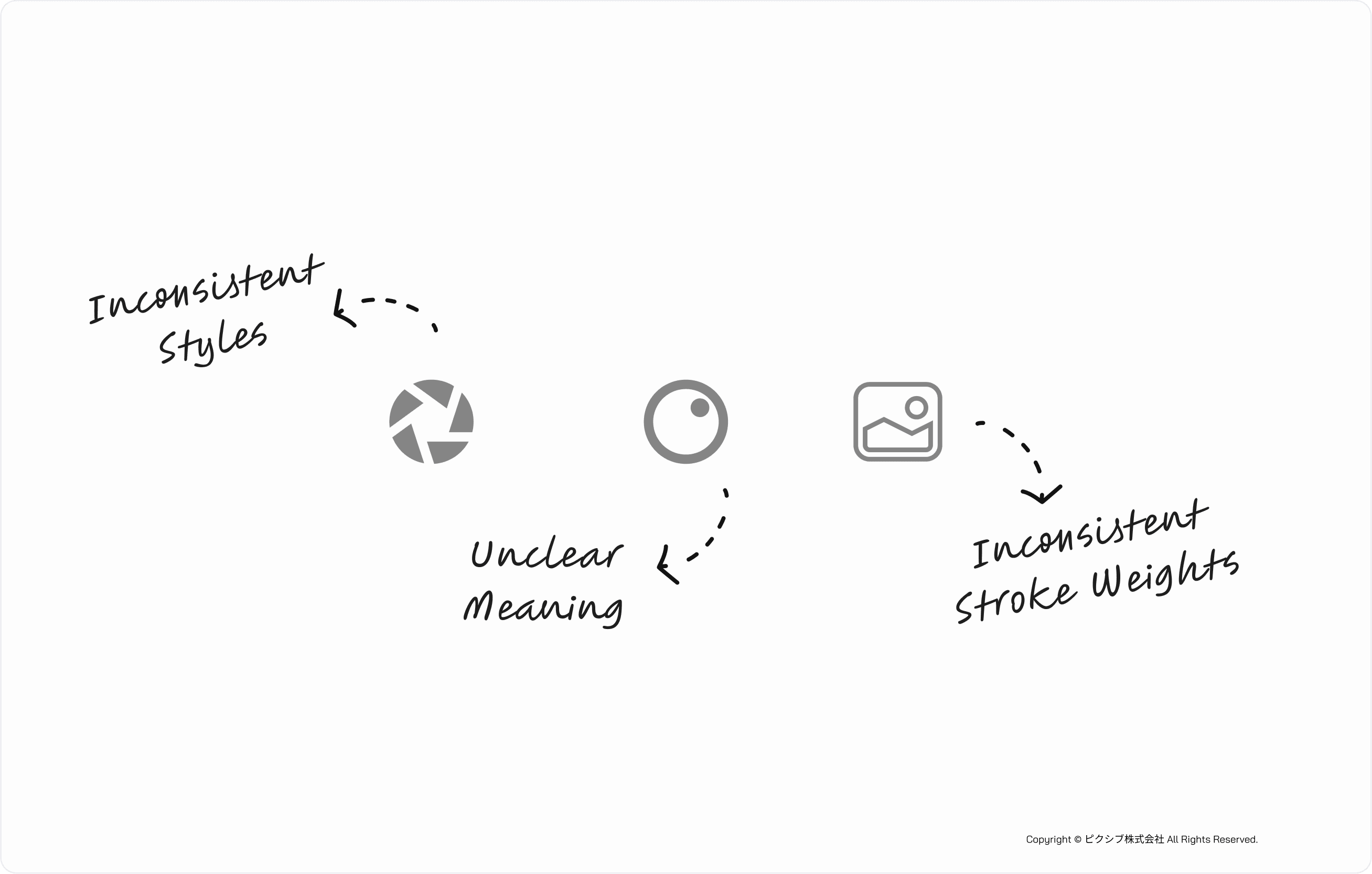
Major issues observed were:
Style: Inconsistent styles and stroke weights.
Clarity: Unclear metaphors affecting comprehension and inclusivity.
Scalability: Mixed mataphor usage across platforms.
Crafting a Unified Visual Language
Given Pixiv's diverse user base, we focused on creating icons that were simple and had a "cute" aesthetic, ensuring they were understandable even for newcomers.
Charcoal icons are designed based on the following principles:
Integration with the design system is essential for a unique icon library.
Icons are meant to be used alongside text.
Scalability is the biggest long-term challenge for icon libraries, especially for small to medium-sized teams.
Flexible, self-regulating guidelines are more effective than strict numerical rules.
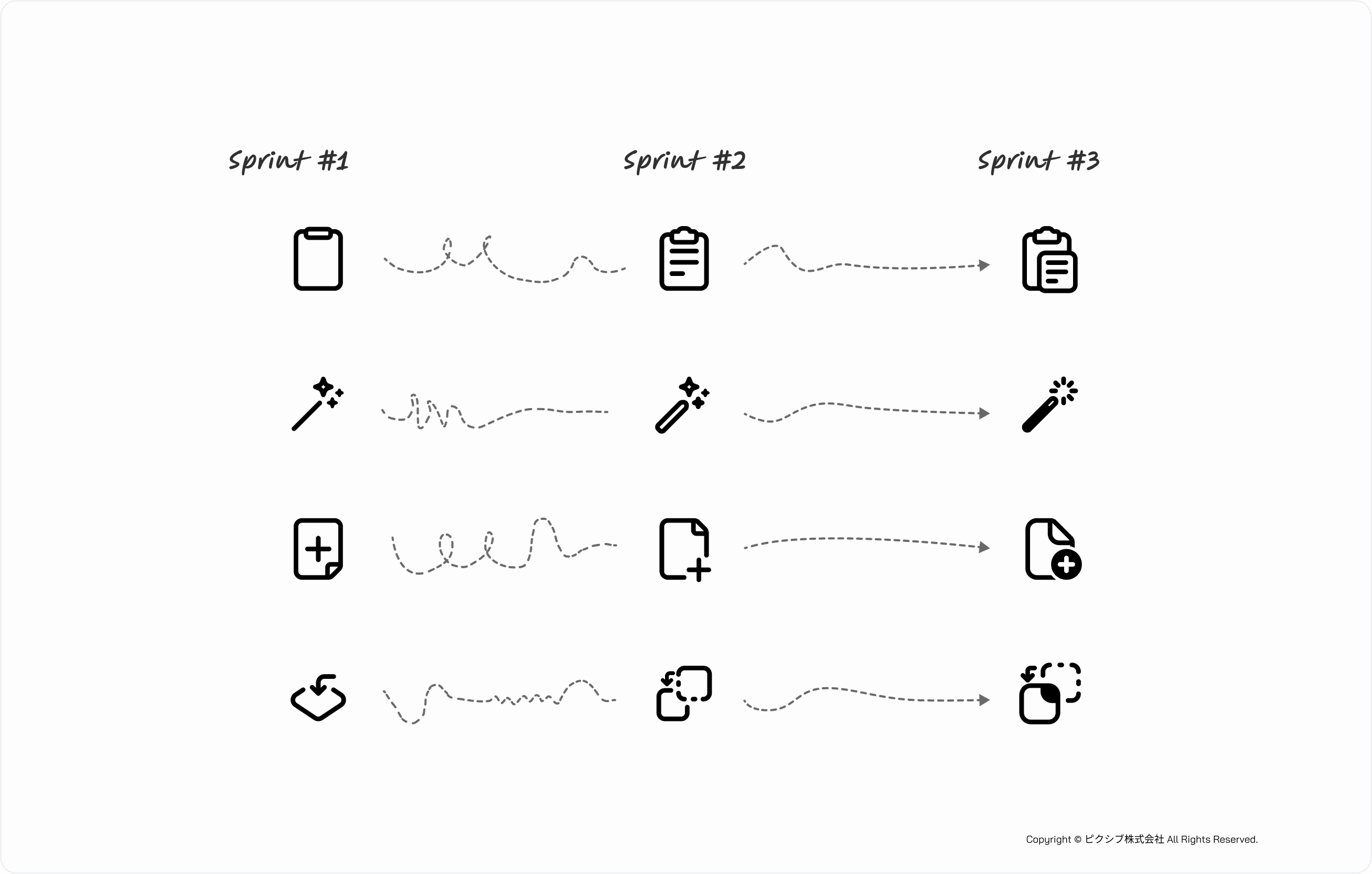
From Concept to Completion, Review & Iterate
The icon design process was divided into sprints, with regular reviews from stakeholders. Feedback was gathered on each icon metaphor, and adjustments were made to ensure clarity and alignment with user mental models. This iterative approach allowed for continuous improvement and alignment with project goals.
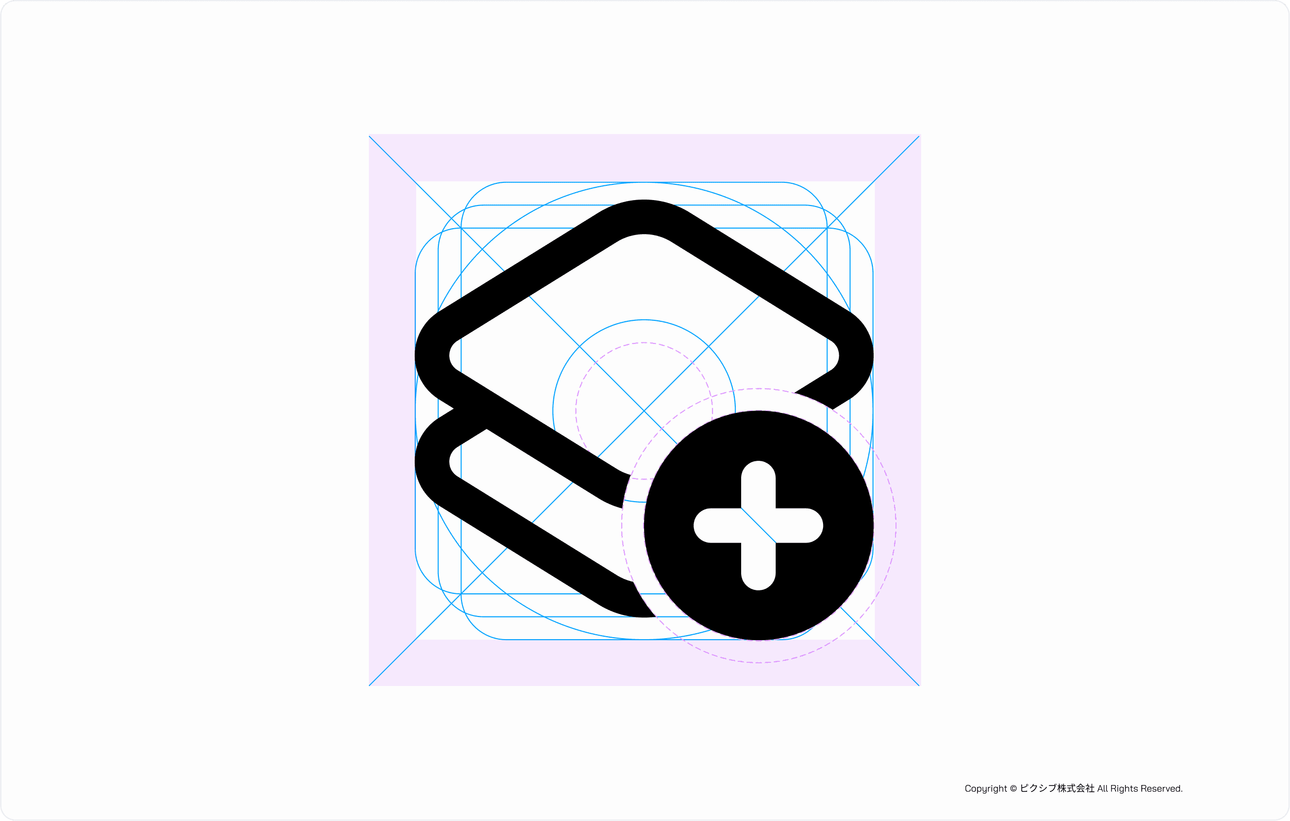
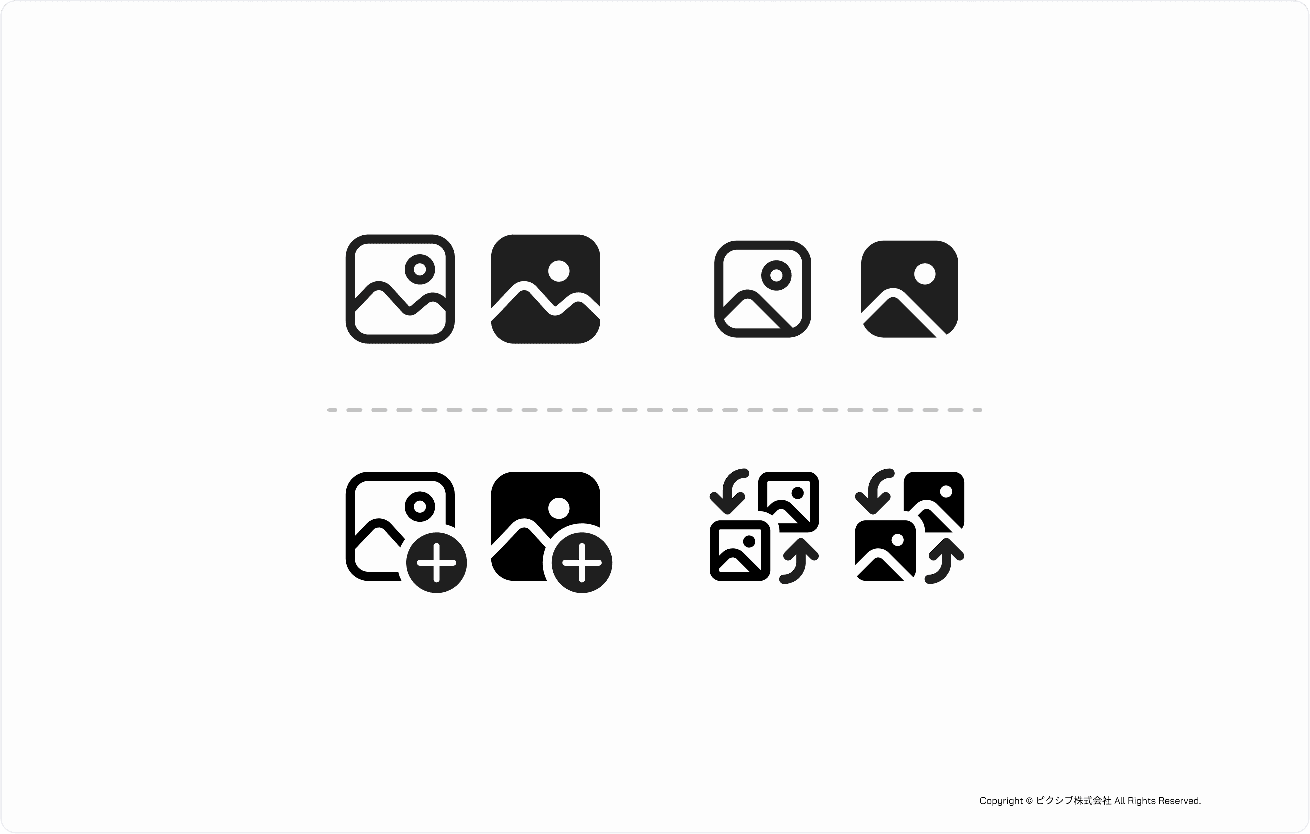
To enhance the scalability and modularity of the icon family, we decided to adopt the Microsoft Fluent pattern for modifiers. This decision was based on the need for a flexible and adaptable icon system that could grow with Pixiv's evolving product landscape. The use of modifiers allowed us to create icons that could convey additional meanings without compromising their simplicity and clarity.
Modifiers are small additional icons placed on a base icon to change or enhance its meaning.
We also developed a custom grid system for modifier alignment, ensuring a uniform look and feel. This approach was refined through several iterations and feedback sessions with stakeholders, including my design manager, product managers, and the CTO.
The final set of over 250 icons was integrated into Pixiv's Charcoal design system and used in the "Pastela" app, contributing to its rapid success on the App Store. The icons were also presented at the Pixiv Meetup 2023, highlighting their scalability and impact across the company.

The impact of our icon redesign
The Charcoal Icons 2.0, available on Figma, offer a modern, handcrafted icon library with features such as:
A component structure focused on customization and scalability.
A drawing style balancing aesthetics with functionality.
Highly detailed documentation covering drawing methods, naming conventions, and design rationale.
Support for both Japanese and English.
Closing
The icon design project was a significant success, resolving inconsistencies and enhancing user experience. Pixiv aims to empower creativity globally; our icon redesign was a crucial step towards a more user-friendly experience, accessible to both experienced and novice creators worldwide.
Future Improvements
While measuring design impact was initially out of scope, I recognize the value of leveraging modern tools to track metrics such as design consistency, scalability, and usage across platforms. This would provide deeper insights into the effectiveness of our work.