Summary
Kiintsugii is an online platform that connects mental health service providers and individuals seeking counseling and support. Their mission, to offer affordable mental health services to users and to help professionals receive fair compensation for their expertise.
I was tasked with leading the redesign of Kiintsugii's brand, creating a cohesive landing page, and establishing design guidelines for the startup's future iterations.
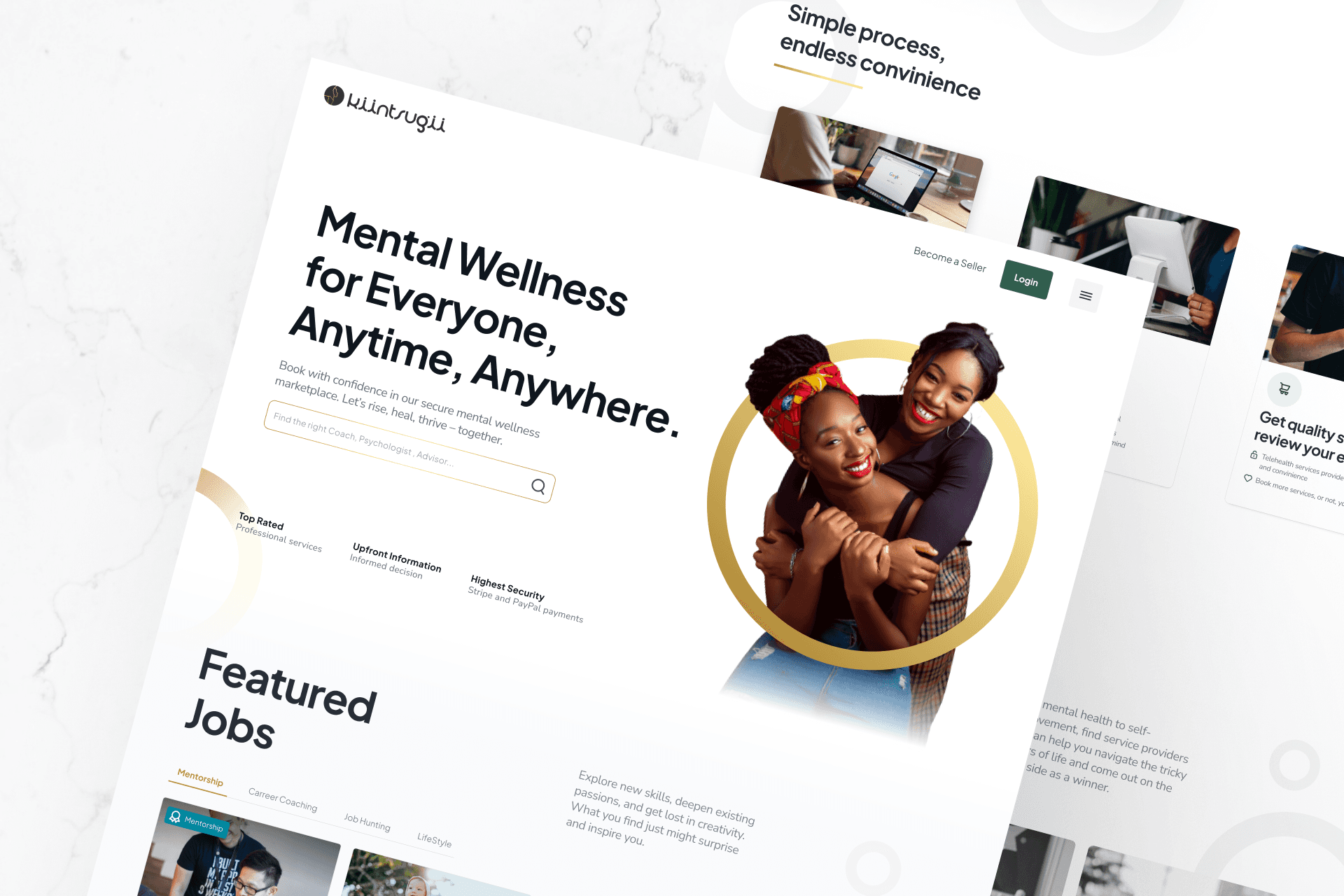
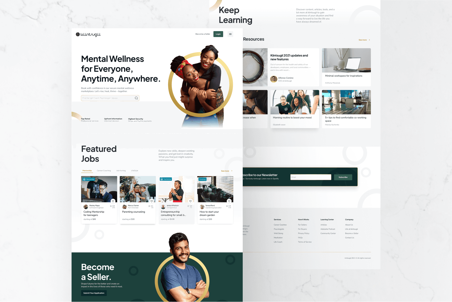
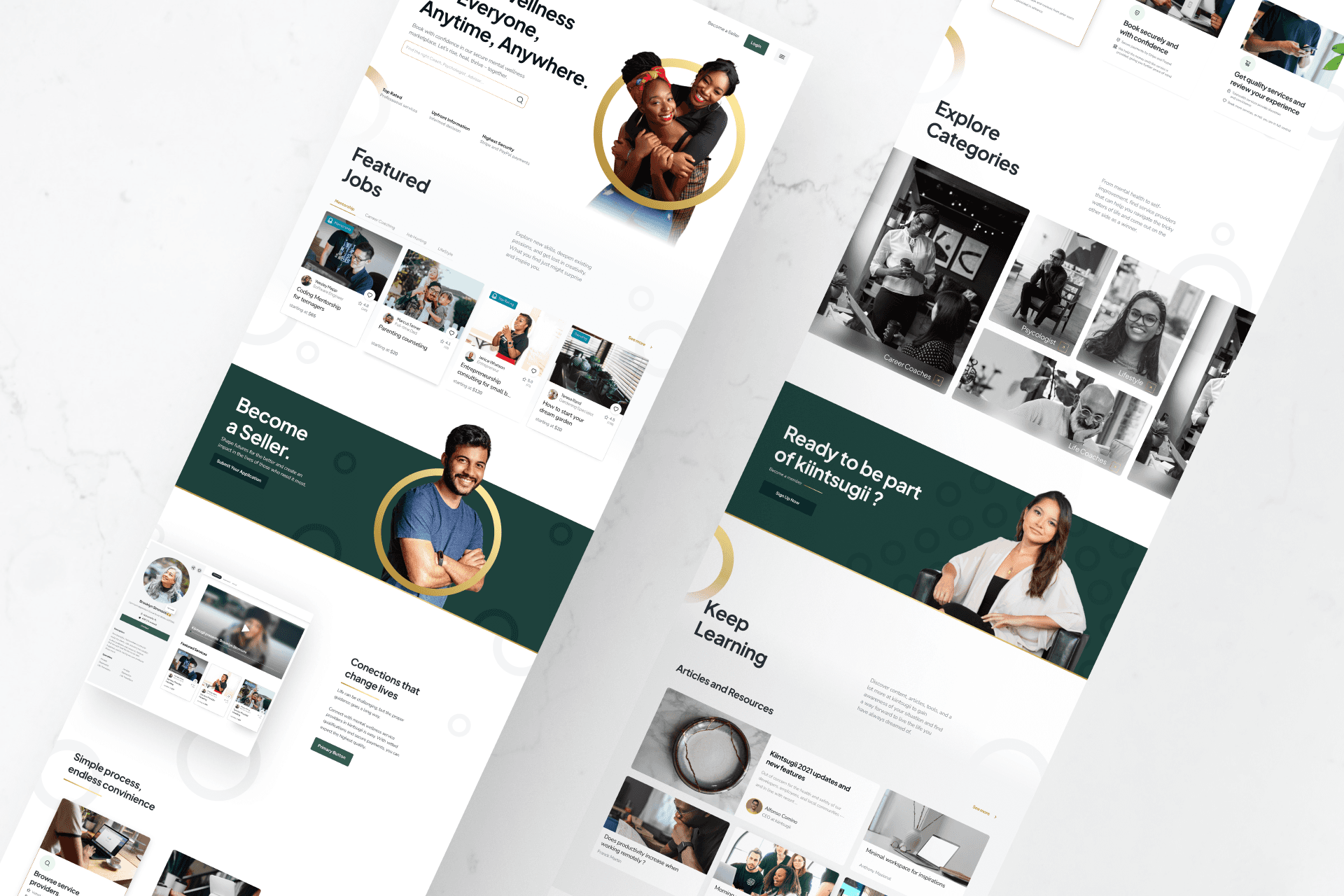
The primary objective of this phase of my work with Kiintsugii was to redesign the startup's landing page, focusing on improving the user experience and providing developers with the necessary resources to implement the changes effectively.
Role & timeline
Freelance UX/UI Designer
Sep 2021 - Nov 2021
Skills applied
Iconography, systems thinking, user-centric design, collaboration
Starting with a collaborative effort to define the requirements for the landing page, we ran several workshops with the CEO and other team members to gain insights into the desired outcomes. Additionally, we conducted analyses of competitor landing pages such as Fiverr and Better Me to understand industry best practices and identify potential approaches for Kiintsugii's redesign that weren't applied:
Upfront benefits: Showing right at the start what value users could get from making use of Kiintsugii's service providers.
Clean design: Extensive use of white space, clear visual groups and imagery to guide navigation.
Establishing Design Guidelines
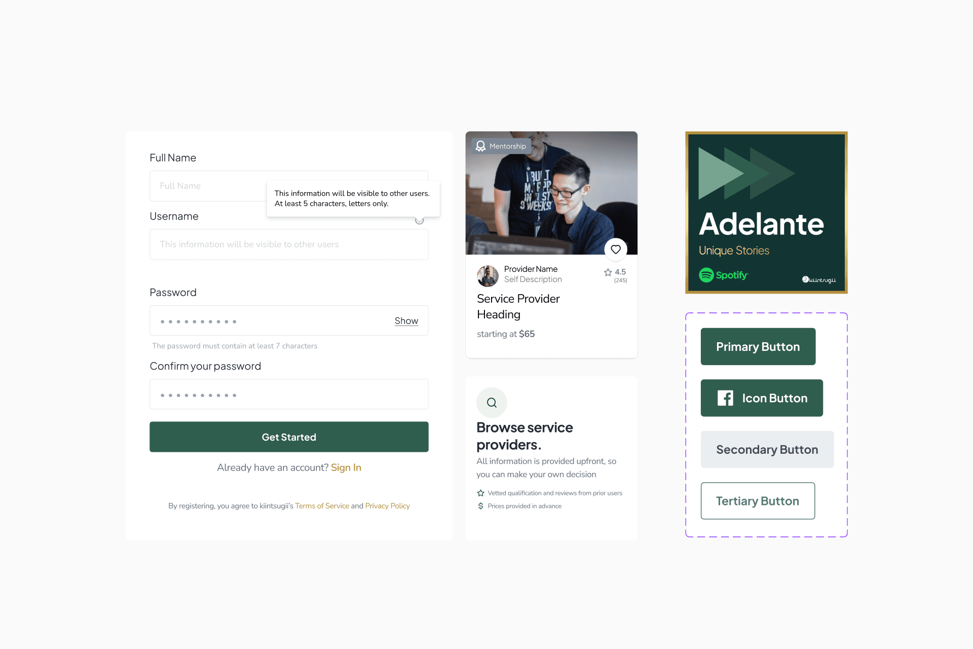
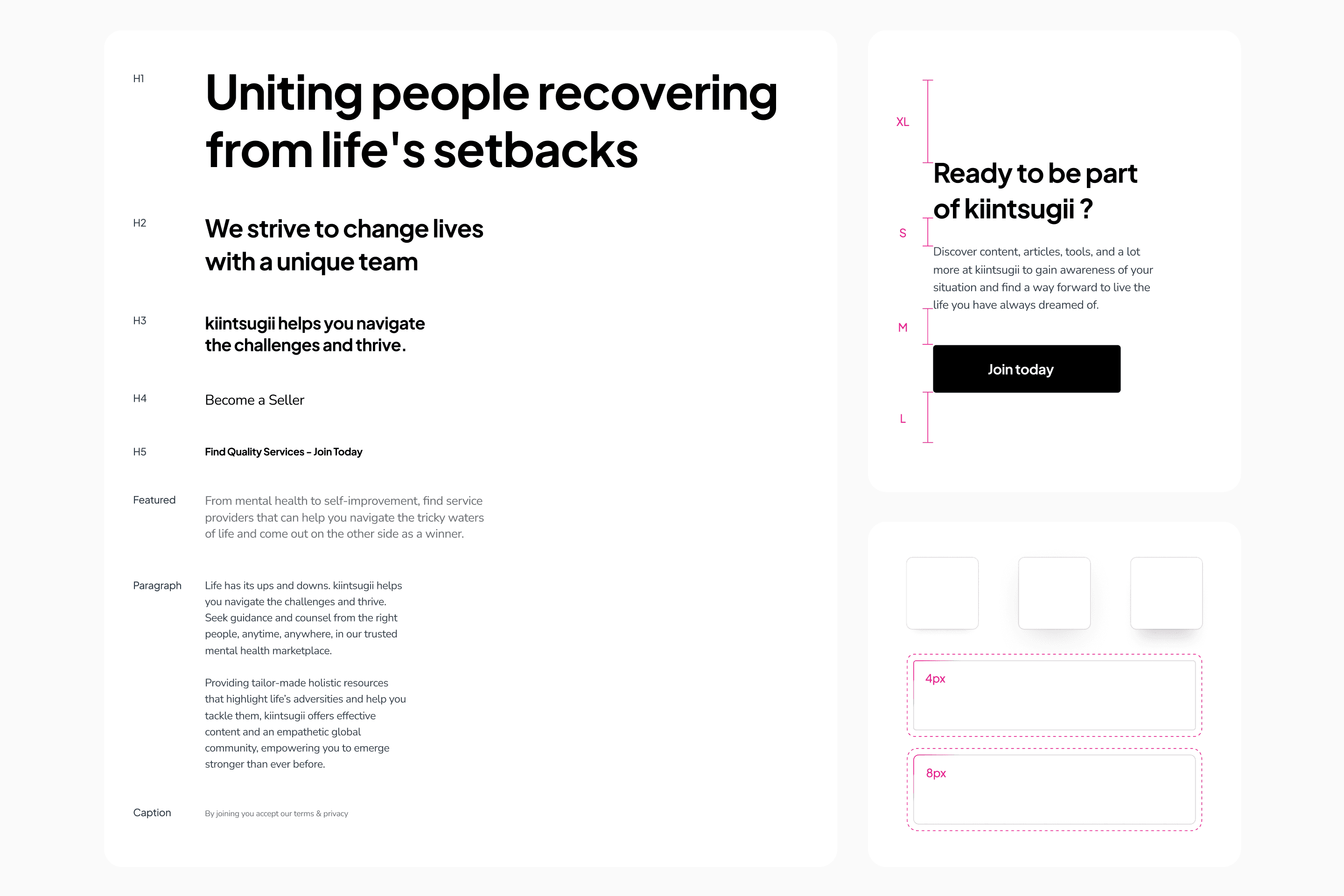
Knowing that other designers may be joining the project, we set on establishing design guidelines to maintain consistency throughout the platform. As the lead designer, I took the initiative to introduce design system practices to the team by creating a set of guidelines encompassing typography, color schemes, button styles, input fields, etc. These guidelines would serve as a foundation for a consistent user experience across Kiintsugii's interfaces.
Designing the landing page
The redesign process involved a constant participation from team members, iteration to the landing page design and its associated sections. We focused on simplifying the layout, emphasizing key elements to create a more engaging and intuitive user experience. The hero section was designed to captivate users with compelling imagery and clear call-to-actions. We strategically placed CTAs throughout the user journey to guide visitors towards exploring Kiintsugii's top service providers and understanding the value they offer.

Zhaoli Jin, Product Design Manager at pixiv inc.